Reporting the gridlock

“Today, our health and care system is in gridlock and this is clearly having a huge negative impact on people’s experiences of care. People in need of urgent care are at increased risk of harm due to long delays in ambulance response times, waiting in ambulances outside hospitals and long waiting times for triage in emergency departments.”
DESIGN SNAPSHOT
Creating a fitting design concept for the Care Quality Commission’s State of Care 2021/22 report and Monitoring the Mental Health Act in 2021/22 report.
CONCEPT | DESIGN | PRODUCTION
Capturing the mood.
This year’s flagship CQC reports (State of Care 2021/22 report and Monitoring the Mental Health Act in 2021/22) make for a sobering read and no mistake. CQC’s work is vital in maintaining a measurable health and care system that in turn aims to reinforces accountability and support. As we developed the design concept we’re reminded that it’s not always the positive sell. Important reports like these are equally if not more in need of strong, well-considered aesthetics to capture the mood in the appropriate way.
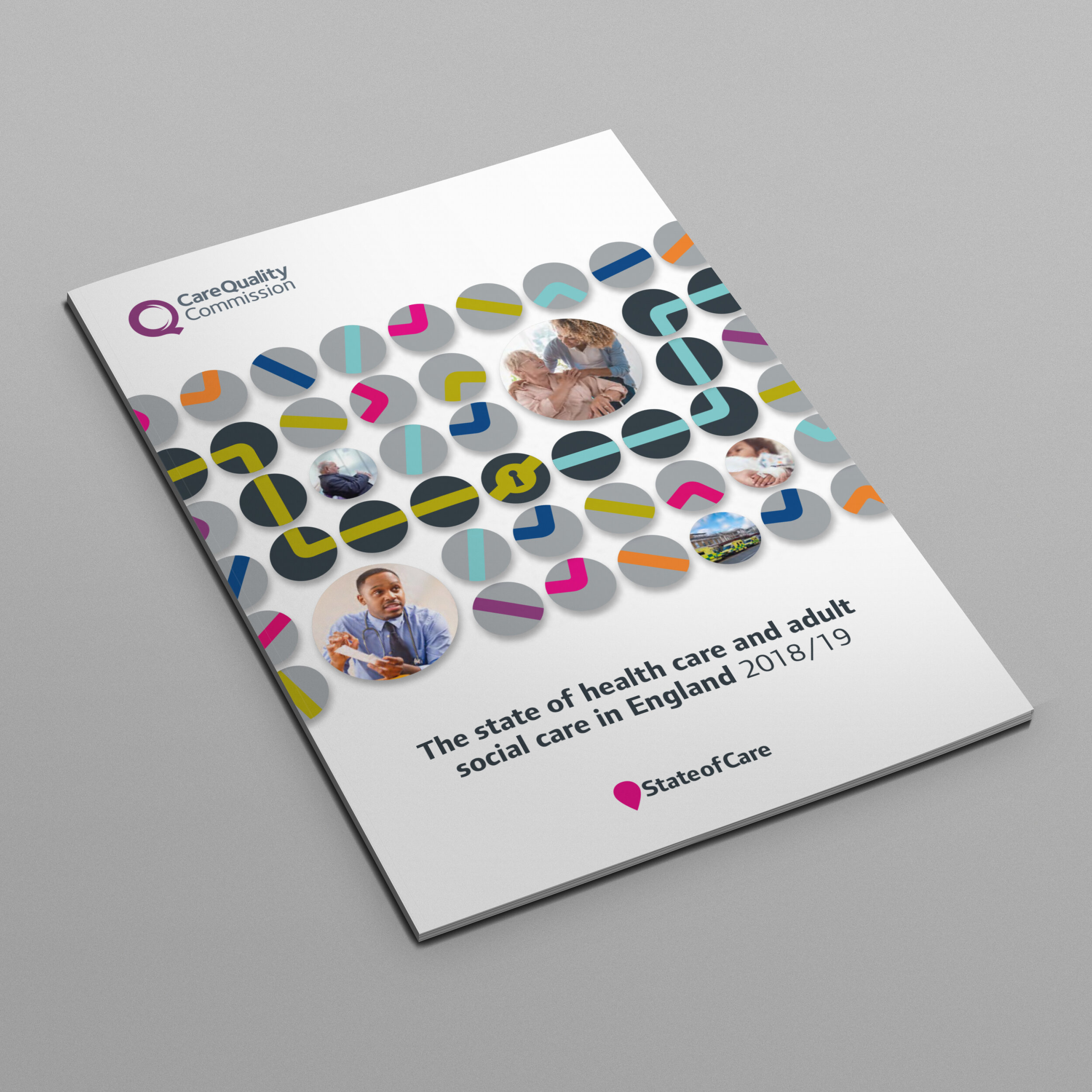
We created a series of graphics which combine two main parts – an irregular shape symbolising that no one person or situation is the same, and an overlaid tilted square as a window on the area of health care focus – each graphic colour-coded to represent a care sector: Hospitals (dark blue), Adult Social Care (lime green), Primary Care (pink), Mental Health (orange).
Campaign support.
As with the previous year the 2022 concept design feeds through to a library of social media and presentation graphics.


